The long-awaited and much discussed scenario on the North Atlantic finally happened this week: No published NAT Tracks, with all aircraft on Random Routes. The concept of free-routing on the NAT is one that airlines in particular have been keen to see for a long time: the ability to decide their own routes, unconstrained by an overlay of tracks that may be tangential to their flight-planning whims.
This is an experiment being led by NATS and Nav Canada (or Shanwick and Gander, if you prefer), and on the face of it, it appears straightforward. Traffic levels are lower at present – about 40% of normal. In January 2021, Shanwick managed 15,241 flights (averaging 491 flights per day), 41% of the January 2020 figure of 36,782 (averaging 1,189 flights per day). A reduction in volume goes hand in hand with a reduction in complexity from an ATC perspective. Without published tracks to assist in separation, the burden on the controller is increased – but the lower traffic levels mean it can be safely managed. Ideal time to try it out.
The concept has garnered much media interest, not least because of the timing of a scientific research paper from Reading University that suggests efficiencies of up to 16.4% can be achieved with this “new idea”. As a result, in the past 10 days the NAT Tracks have featured on CNN (“Airlines can now pick their own routes across the Atlantic. Huge fuel savings could follow”) and the Independent (“‘Surfing the wind’ could allow aircraft to cut carbon emissions and reduce flight times”). Headline: New York-London journeys could be cut by 21 minutes.
The media, and even our own industry news coverage, would have us believe that somehow we’ve just stumbled onto some preternatural scheme of harnessing the power of the wind, to spirit our hulking lumps of metal across the pond. Jet streams, you say? Pray tell.
Let’s clarify something first. Aviation contributes around 2% of global CO2 emissions. Global warming is a danger to our entire existence. We are an industry founded on innovation and ingenuity, and we should be looking for every opportunity to do something more than just shave a few dollars off a route cost. We need to open our minds, stop being quite so defensive about aviation, collaborate with science and research, and above all recognise the impact that aircraft are having on the environment. We need dramatic change.
In the cold light of operational reality, however, all is not as the public coverage seems. The Shanwick/Gander No-Tracks experiment itself is founded on solid ground – the results will provide useful insight, and the reasoning for it is sound. The research paper, however, and associated media fanfare, has shakier foundations. In fact, there are fundamental flaws in the assumptions made to reach the headline proclamations of 16.4% and 230km (125 nautical mile) savings on route distance.
We’ll look at three things in this article …
One: How an aircraft operator actually chooses a route across the NAT
Two: The ATC perspective; why No NAT Tracks is not as easy as it might sound.
Three: A review of the research report from Reading University.
Part One: How does a NAT route get chosen?
The hardest thing in life is knowing what you want. It’s no different on the NAT. The process for selecting a route across the ocean is more complex than it might seem. At first glance, it might appear that the most logical route is the best wind route, in other words, the track across the ocean where we can take maxium advantage of the jet stream. In the Reading University report, this is called the “OFW: Optimized for Wind Route“. Let’s see why this is not the case.
There are four track calculation options available to most aircraft dispatchers and flight planing systems:
A. MDT: Minimum Distance Track. Departure to destination with shortest distance (ie. Great Circle track). Only sensible if there is no wind, which never happens.
B. MFT: Minimum Fuel Track. Departure to destination with lowest possible fuel burn. Equivalent to the OFW/Optimized for Wind Route.
C. MTT: Minimum Time Track. Departure to destination in shortest possible time. Often very similar to the MFT.
D. MCT: Minimum Cost Track. Departure to destination with lowest cost – considering not just fuel, but navigation fees, and the cost of time (eg. knock on schedule effects, missing curfews etc.)
Which is the most commonly used? Minimum Cost Track, by far. Minimum Fuel is good. But for aircraft operators, we have to consider whether saving 100 kgs in fuel results in being 10 mins late to stand, or makes us overfly a much more expensive country, or miss a curfew time at the airport.
A North American OPSGROUP airline dispatcher told me: “To give you an idea of cost, a Minimum Time Track (MTT) or Minimum Fuel Track (MFT) for our Boeing 777 from the west coast of North America to east Asia can cost anywhere from $10,000 to $15,000 more than taking an MCT. The difference? The MTT and MFT will go through Russia [where navigation fees are much higher]. The MCT stays on the North Pacific in Oakland and Fukuoka airspace. But that cheaper route can be 30+ minutes longer.”
And even then, that’s not the track the operator might want to fly. One big consideration: Turbulence.
In the winter months in particular, the eastbound jet stream can be nasty. The place where the most efficient route lies is efficient because that’s where the winds are strongest. This is often also where the core ‘efficient’ NAT Track Xray or Zulu lies these days. A 200 knot tailwind is great, but it comes with a sting in the tail: severe turbulence. The same dispatcher told me: “In the last week, we’ve not flown the NAT Tracks because of multiple patches of severe turbulence, both forecast and reported by other airlines”.
Planning a real-life NAT route from start to finish: eight steps
We’ll look at an eastbound flight from New York Kennedy (JFK/KJFK) to London Heathrow (LHR/EGLL). Given that the research paper mentioned above identifies maxium fuel savings eastbound of 16.4%, this is a good example to choose. On the maps that follow, you will see the there are eight steps, starting with the great circle track, and working through what happens in practice until we reach the actual route flown. The aircraft in this example is a Boeing 787, which has an optimum altitude of FL390 (presure level of 200 hPa) at operational weight (~85% of MTOW). Therefore, the winds shown are those at FL390. For track planning, we will consider only the track from Top of Climb (first point of cruising altitude) to Top of Descent (beginning of descent into LHR). The map also shows the ATC areas that will control the flight in the enroute phase. The jet stream is shown as background: the whiter, the faster.
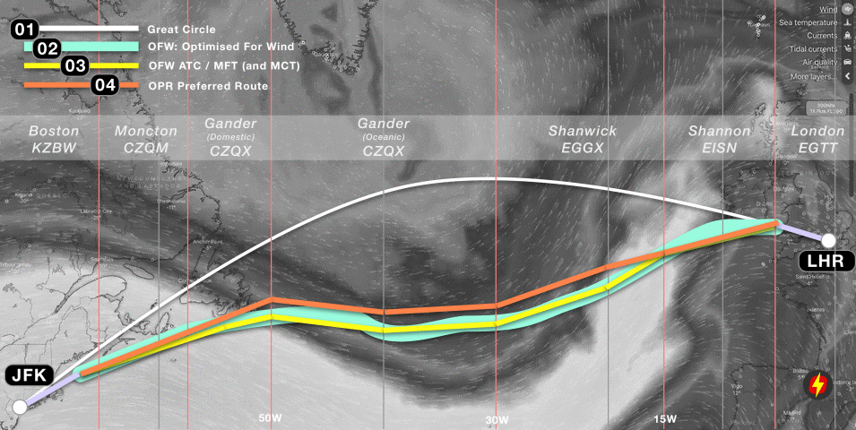
01: GC: Great Circle Route. The shortest distance between JFK and LHR. This does not take winds into account, so to find the best wind route, we must add wind from the forecast for FL390 for our time of flight.
02: OFW: Optimised For Wind route. The track taking maximum advantage of the winds at FL390 (39,000 feet, or the 200 hPa pressure level in ISA).
03: OFW ATC route. The OFW route as adjusted for oceanic ATC flight planning limitations – which are: 1. You must use fixed 1/2 degree latitude points at every 10 degrees of longitude from Oceanic Entry Point to Oceanic Exit Point. 2. You must fly a straight line from that point to the next 10 degree longitude line. This route equates to the MFT (Minimum Fuel Track) in flight planning systems, and in our case here, also the MTT (Minimum Time Track). For some NAT routes, overflight fees will be a consideration (for example, avoiding higher charges in UK and Swiss airspace on routes that go further into Europe) – but here, they are not, so MCT (Minimum Cost Track) is also the same. In other words, OFW ATC = MFT = MTT = MCT.
04: Operator Preferred Route. The next big consideration is turbulence. In this example flight, there are moderate-severe turbulence warning patches at several points on the ATC OFW/MCT route above, so the dispatcher elects to move it a little further north – still gaining from the eastbound jetstream, but outside the core jetstream which has the highest turbulence.
We can now move on to the next stage of planning in a real-world scenario: accounting for a high volume of other traffic, ie. matching the Operator Preferred Route to the closest NAT Track of those published for the day of flight.
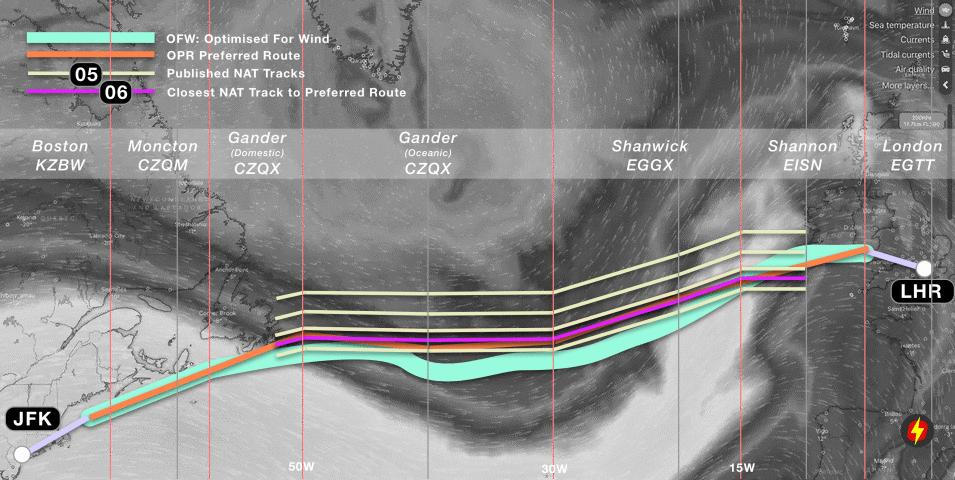
05: Published NAT Tracks. Once a day, Gander issues the NAT Track Message for Eastbound Tracks, which allows Air Traffic Control to safely separate the peak flow of flights from the US to Europe. In this case, there are five tracks.
06: Closest NAT Track to Preferred Route. This is a simple calculation – which NAT Track most closely matches the Operator Preferred Route across the ocean. In this case, it is highlighted in purple, and is a relatively close match.
Finally, we can account for what will happen at the time of flight …
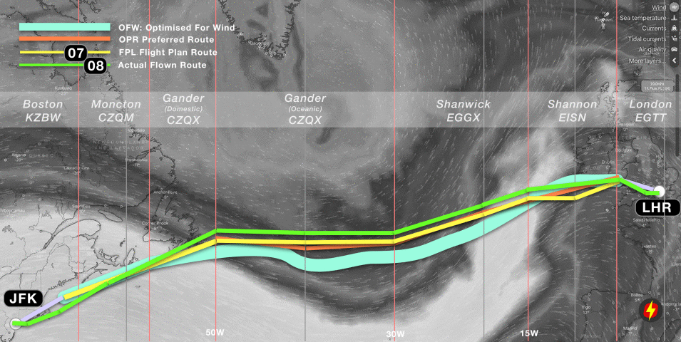
07: Flight Plan Route (FPL). With the choice of track made, the operator will then file the Flight Plan with their requested route, several hours in advance of the flights’ departure from JFK. The purple track above at Step 6 (closest NAT Track) becomes the yellow track in this step, to which the domestic ATC routings are added. Once airborne and enroute, about an hour from the Oceanic Entry Point at 50W, the crew will request their Oceanic Clearance from Gander, as per this flight plan route.
08: Actual Flown Route. For this flight, the requested track was not available at FL390 (because of other traffic ahead). The crew were given a choice of either a more notherly NAT track at their preferred level (FL390), or their requested NAT track at FL370. The altitude difference would have made for a greater fuel burn than a slightly longer distance, so the crew elected to take the more northerly track (30 nautical miles further north laterally, but in terms of distance flown adding about 20 nautical miles). At 15W, the flight is under radar coverage from Shannon, and was cleared direct to the Strumble (STU) beacon in Wales (which was the original planned Top of Descent). The green track therefore depicts the actual route flown.
Where did we lose most efficiency?
Since the background to this article is considering the benefits of not having to follow prescribed NAT Tracks, the key question is – where has most efficiency been lost on this flight?
- Loss 1: The difference between the Minimum Fuel Track (MFT) (or “ATC OFW”) and the Optimized for Wind Route (OFW). Some efficiency is lost because the OFW is constrained by flight planning requirements – specifically having to flight straight lines between each 10 degrees of longitude, and having to cross each 10 degrees of longitude at 1/2 degrees of latitude. The “route of straight lines” is, of course, longer.
- Loss 2: The difference between the MFT and the Operator Preferred Route. In this case, the operator chose to move the track further north to avoid turbulence. This decision creates an efficiency loss in terms of fuel burn, because the minimum fuel track is no longer being followed.
- Loss 3: The difference between the Operator Preferred Route and the closest matching NAT Track. This is the key efficiency difference when considering gains from the “No NAT Track’s” experiment.
- Loss 4: The difference between the NAT Track requested (Flight Plan Route) and the Actual Route flown. There is a mixed bag here. On the one hand, if the operator has to fly anthing other than the requested route, they lose efficiency to some degree. In this case, ATC could only offer a lower level, or a more northerly route. On the other, domestic ATC (using radar) often provide shortcuts which lessen the track miles flown.
A scientific analysis of a series of actual flights would reveal the numbers involved in the four different areas of efficiency loss – and this is roughly the aim of the OTS NIL experiment that Shanwick and Gander are conducting,
Part Two: Why we might still need NAT Tracks
The narrative in the majority of recent reports about the North Atlantic tell us that because we now have ADS-B satellites, and thereby excellent surveillance, this changes the entire landscape, and allows for the disbanding of NAT Tracks. But this overlooks a key point: it’s not a surveillance problem, it’s a comms problem.
We’ve got surveillance nailed – it’s basically the same as radar, now that the full complement of Aireon ADS-B satellites are up and running, complementing the ADS-C coverage already in place. So, controllers can see the aircraft in much the same way as a domestic radar controller. That’s exciting.
However, it’s a bridge too far to assume that just because surveillance is good, we can start treating the Air Traffic Control of NAT aircraft as if it were somewhere in the centre of Europe.
And the reason: instant communication. In a domestic ATC environment, the approximate sequence of events goes like this (callsigns dropped from some calls for clarity):
Controller (thought): … Hmmm, Delta and Speedbird are getting a little close. I’ll climb the Delta.
Controller: Delta 63, climb FL360.
Delta 63: Sorry, unable 360, we’re still too heavy.
Controller: Delta 63, roger, turn right 10 degrees due traffic.
Delta 63: Roger, right turn heading 280.
And Delta turns. Conflict solved. That entire sequence of events takes about 10 seconds. Now consider the Oceanic environment. CPDLC is a hell of a lot better than HF, but the target time for the same sequence of events is 240 seconds, or 4 minutes. That’s the basis of RCP240.
See the ATC problem? We can see the traffic now, but we can’t be sure that we can move it around in the same way as a real radar environment, because we don’t have VHF.
This is why the new satellite coverage does not go all the way to allowing a full reduction in separation to the standard enroute value of 5 nautical miles. Oceanic ATC, even with this additional surveillance, remains more of a procedural environment – and separation standards cannot yet drop. In the same vein, we’re not yet at the point where we can solve enroute conflicts with a few vectors and “on your way”.
And therefore, removing the NAT Organized Track Structure for high volumes of traffic is a big challenge.
Part Three: The Reading University Report
Published in January 2021, a paper from Reading University titled “Reducing transatlantic flight emissions by fuel-optimised routing” suggested that “current flight tracks [on the North Atlantic] have air distances that are typically several hundred kilometres longer than the fuel-optimised routes”, that by using the optimal wind route eastbound flights would save on average 232 km, and that an efficiency gain of up to 16.4% would be possible. These headline figures are the ones taken by the media in the last few weeks resulting in articles suggesting that the average New York-London flight could arrive 21 minutes earlier [Independent >].
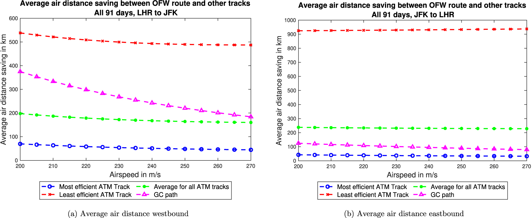
The paper shows these graphs, with the eastbound plot on the right:
From an operational perspective, however, the promise of 232km (125nm) average route savings, and 16.4% increases in efficiency do not ring true. If you are a dispatcher, or pilot, you will share my instinct that this number feels extremely high. The term “potential increase in efficiency” really means “current inefficiency” – and my gut feeling says it’s not always ideal, but far from that bad. Many plans are indeed sub-optimal, and crossing the NAT certainly has the potential to result in a track a half-degree north or south of the one requested or a level below the optimum – but is the inefficiency really that high?
Closer analysis shows that at least some of the assumptions in the report to be fundamentally flawed.
The report itself makes the flaw clear here: “Taking the results for an airspeed of 240 m s−1 and averaging savings in air distance between the most efficient ATM track and the OFW route across all 91 days of winter 2019–2020 for flights from JFK to LHR, gives an air distance saving of 37 km, but the saving for the least efficient ATM track is over 931 km. The average saving for all ATM tracks is 232 km”
The problem is that to reach these high numbers, the paper is assuming that “airlines use all provided tracks equally“. This is not what happens in reality, by any stretch. There are normally 8-10 NAT Tracks eastbound. An airline, or aircraft operator will request their Preferred Track, as we have seen in the example above. Almost all of the time, the requested track is granted, albeit with potentially a lower level (or higher) than requested. Very ocasionally, a track one north or one south is given by ATC.
The efficiency figure of 16.4% is created by dividing the air distance between LHR-JFK by additional distance flown on the least efficient eastbound NAT Track (2,997nm/503nm ~ 16.4%). That least efficient NAT Track (which will usually be Track Zulu in non-Covid ops for an eastbound flight) is normally a southerly Caribbean area route intended for traffic departing places like Miami, the Bahamas, or even Trinidad and Tobago. It will never be flown by a New York-London flight.
Therefore, we have to disregard these higher numbers entirely.
The report does identify, when looking at actual flights, that efficiency savings of “2.5% for eastbound flights and 1.7% for those flying west” would be obtained by flying the optimum wind route (OFW). Those numbers look far closer to what we might expect as total efficiency losses identified at the end of Part One, above.
However, consider further that we looked at four different types of efficiency loss: flight planning constraints, avoiding turbulence, the NAT Tracks requirement, and tactical routing by ATC. It is clear, then, that the presence of the NAT Tracks accounts only for a portion of those inefficiencies. Again, real world analysis of actual flights with the full compendium of information as to what caused the ineffciencies would give the most insight, and this is what we will hopefully see from NATS and Nav Canada as a result of the “OTS NIL” experiment.
A further paper as an iteration of the first, applying a collaborative approach with the operational world (ATC, Airlines, Aircraft Operators, Flight Crew), would be beneficial.
Over the past 25 years, there has been continual improvement in ATC efficiency. The NAT region was the first to implement reduced vertical separation (RVSM), in March 1997, and subsequent improvements in surveillance (ADS-B, ADS-C), and communications (CPDLC), have led to lateral separation improvement from 60nm to 19nm, and longitudinal from 80nm (or 10 minutes) to as low as 14nm – in addition to the altitude separation reduction from 2,000 to 1,000 feet. In simple terms, the number of aircraft that can fly closer to the optimum route for a city pair has dramatically increased.
Despite the inaccuracies in the numbers, we should look at the bigger picture: The paper does identify a key point that we should digest in this industry: “Airlines currently choose routes that minimise the total cost of operating a flight (by specifying a Cost Index, which is the ratio of time-related costs to fuel costs), not the fuel consumption or emissions.”
This, I think, is important to consider. We are not currently flight planning to minimise emissions – we flight plan to minimse cost. With the reality of our warming planet, and the thankfully growing recognition that a corporation’s profit should not come ahead of the greater good of humankind, focus should be placed on how we can operate flights more efficiently – where ‘efficient’ does not mean reduced costs, but reduced emissions.
More on the topic:
- More: Timeline of North Atlantic Changes
- More: NAT CPDLC Route Uplinks: Crew Confusion and Errors
- More: New NAT Doc 007: North Atlantic Changes from March 2026
- More: What’s Changing on the North Atlantic?
- More: Shanwick Delays OCR Until Post-Summer 2026
More reading:
- Latest: Paris Ramp Checks: Illegal Charters and Tax Avoidance
- Latest: Middle East Airspace – Current Operational Picture
- Latest: Greenland NAT Alternates: March 2026 Update
- Safe Airspace: Risk Database
- Weekly Ops Bulletin: Subscribe
- Membership plans: Why join OPSGROUP?


“Global warming is a danger to our entire existence. ”
Thats alarmist nonsense.
Great read guys. Thanks.