Internet rulebook: Flashy is better. Make it polished, add images, video, a quote, and wrap it up with some ads. Sometimes (often, mostly?) – that’s a tedious way to get through simple information. It’s a clear message that the reader isn’t being put first.
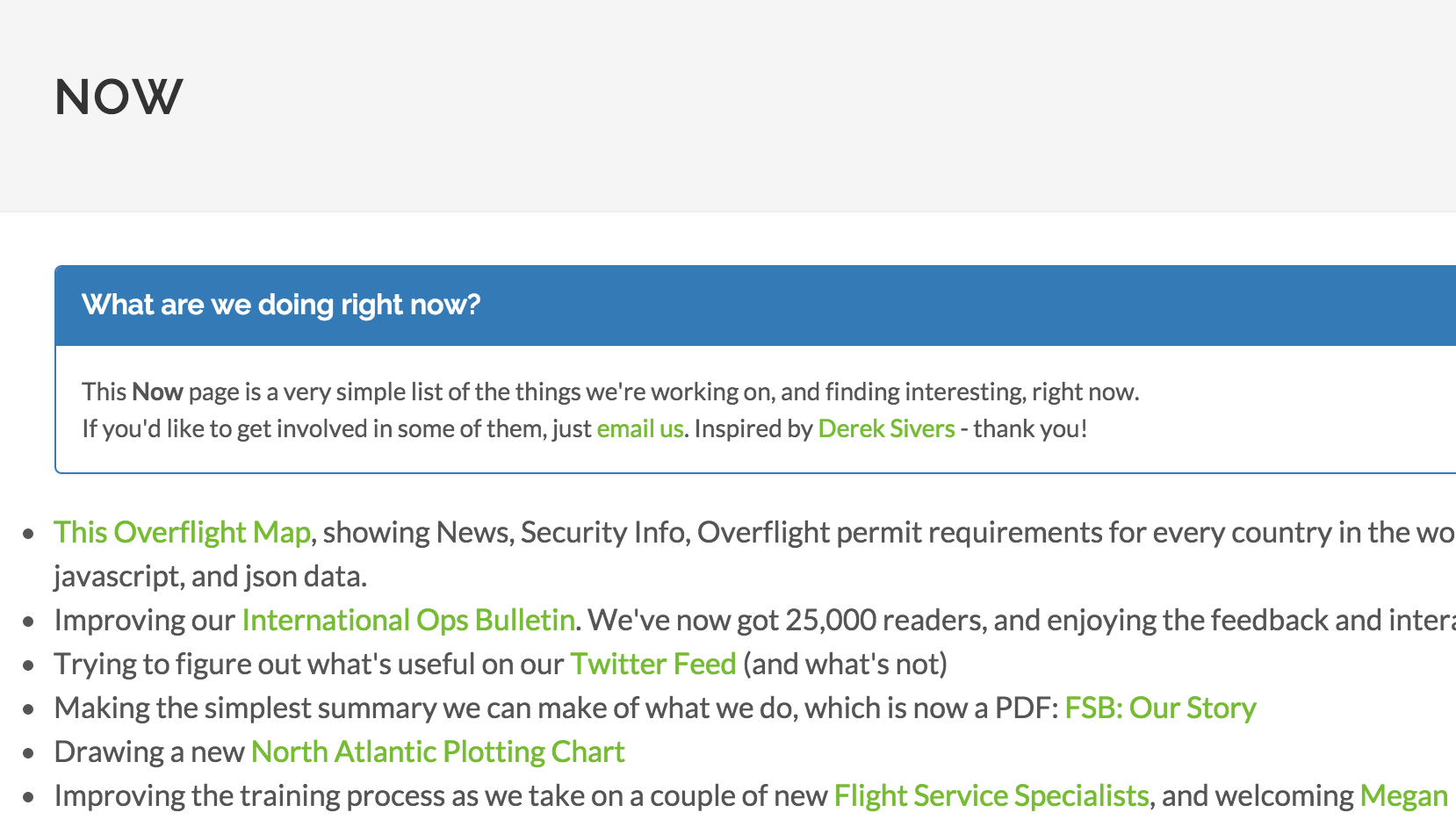
Most websites have an “About”, and a “Contact us”. But what is that person, or that company doing now? Would it be useful to have a “Now” page? We thought it might be, and we also thought the simpler, the better.
So, we added one, and you can see it at fsbureau.org/now.
More on the topic:
- More: Paris Ramp Checks: Illegal Charters and Tax Avoidance
- More: Middle East Airspace – Current Operational Picture
- More: Greenland NAT Alternates: March 2026 Update
- More: Every flight leaving Singapore will pay a SAF fee
- More: Timeline of North Atlantic Changes
More reading:
- Latest: Paris Ramp Checks: Illegal Charters and Tax Avoidance
- Latest: Middle East Airspace – Current Operational Picture
- Latest: Greenland NAT Alternates: March 2026 Update
- Safe Airspace: Risk Database
- Weekly Ops Bulletin: Subscribe
- Membership plans: Why join OPSGROUP?





 Get the famous weekly