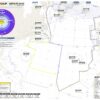
Apart from the routine Flight Operations that we support at the Flight Service Bureau, we spend a fair bit of time building new things. Much of time, those things involve maps, and so we keep our eyes out for new ideas … and we especially liked this graphic presentation of US Winter Storm Jonas at the end of January 2016.
We took the original and slowed it down a little, but what you’ll see here is forecast data from NOAA’s High Resolution Rapid Refresh Model to animate the storm’s arrival in the Mid-Atlantic. The map shows water equivalent accumulated snow depth, or WEASD, which we can think of as the volume of water contained in the snow on the ground.
More on the topic:
- More: SE Asia Monsoon Season: What Are LSWDs and Why Will They Cost You Fuel?
- More: Microbursts: The clouds are gonna get ya!
- More: What’s the delay in the USA?
- More: 2020: A Record Breaking Hurricane Season
- More: The mystery of the missing Russian Weather
More reading:
- Latest: Gander’s Bringing Back CPDLC Oceanic Reroutes
- Latest: EU Temporary Admission of Aircraft – Busting Myths
- Latest: US Ops Update: Speeds, Squawks and Slippery Runways
- Safe Airspace: Risk Database
- Weekly Ops Bulletin: Subscribe
- Membership plans: Why join OPSGROUP?